Journal
Colour is subjective. Colour is emotion. Colour is mood. Colour calms, inspires, excites. Colour can make a bespoke kitchen bright and vibrant or it can make it sensitive, enveloping and warm.
Different people are drawn to different colours; rich warm shades, or cool calm tones. From the ancient Greeks to the psychedelic 60s, periods in history have influenced the way in which we perceive colour, and no more so than through interiors and bespoke kitchen design.
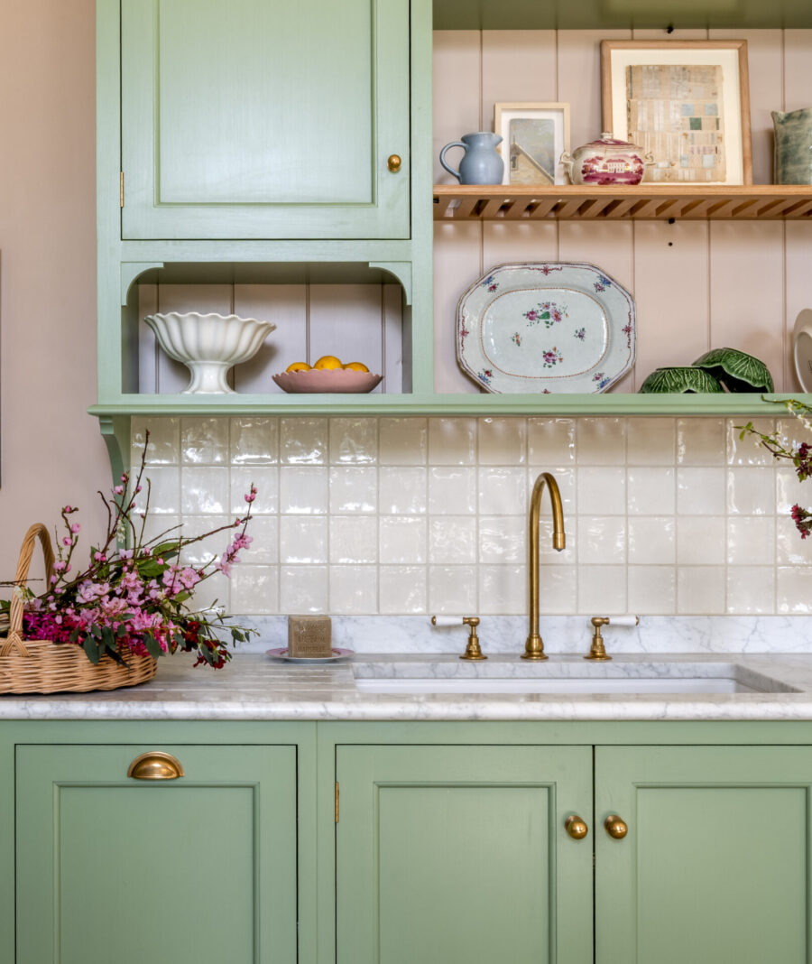
Guild Anderson’s Colour Consultancy Service
Hannah Anderson, our founding partner and Marketing Director, offers our colour consultancy service to all clients once the design has been finalised, describing it as ‘more of an informal palette suggestion, rather than a full-on interior design solution’.
‘Most clients have a piece of fabric, a piece of furniture or a paint colour they have their eye on; but they don’t always know how best to put them together’. This service is an integral part of the bespoke design process that Guild Anderson offers.
‘Our clients really enjoy the opportunity to chat over their renovation project from a lighter viewpoint. Taking time to stand back and reflect is important. Imagining the overall look of the room should be the upside of a project – and from a slightly more fun perspective than deciding where to locate the plumbing or electrics!’
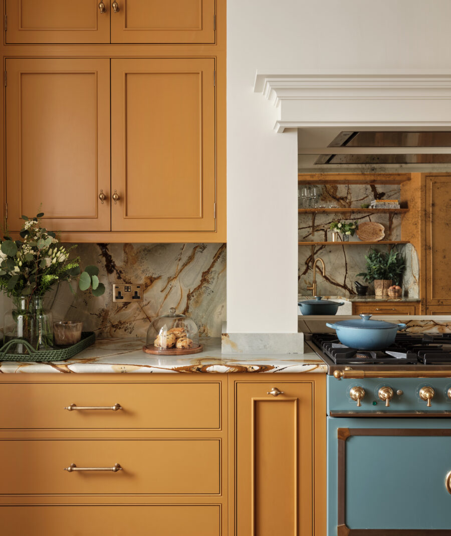
Colour Consultancy Advice Is Invaluable
Choosing the right colour for a hand painted kitchen, with such an enormous choice of paint colour, can be tricky.
There has been an explosion in heritage and craft paint libraries – the choices of colour, hue and finish can be bewildering. Deciding on paint colours may appear superficially to be less important, but Hannah cautions clients to take equal time on the finish for their cabinetry, walls and woodwork.
‘Paint can be a huge investment so shouldn’t be underestimated,’ she says, ‘You can of course change it if you do get it wrong; but it is the labour, not the paint, that is so expensive in repainting cabinetry or walls.’
The appeal of Guild Anderson’s kitchens is a perfect balance of craftsmanship and design: partly the considered layout to the room, the clear quality of the cabinetry, but also the colours which should all be in harmony with one another.
Guild Anderson’s kitchen colour consultancy service is an intimate and personal part of the process of designing your cabinetry. Our task is to guide our clients through their colour journey – a reflection on the tastes and style of the owner.
One client sums up Guild Anderson’s colour palette as being ‘Simply good taste, interesting, intriguing, the kind of colours that you will never regret & friends will always ask what it is.’
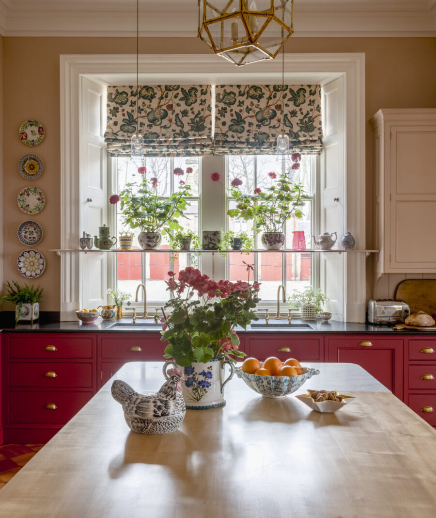
How Our Colour Consultancy Works
Hannah will meet with you at our Design Showroom in Tisbury, Wiltshire to discuss all colour options in your new kitchen.
Hannah explains that ‘Natural light hugely affects paint colour, as will the aspect of the room, so this needs considering’. Hannah advises to always try paint samples on different walls once you have plastered the walls and they have been given the time to dry as this will change the colour; but it is also good to note that it is hard to see the complete picture until you have the lighting installed.
‘What is wonderful with the better quality paints is the variances are greater, so a colour will look quite different if choosing the same paint as a friend’.
From this initial meeting, Hannah will present up to three different palette selections based on your personal taste; which you can then chose from. These will incorporate the worktop, hardware and flooring choices which are often worked through during the colour meeting; as well as the colour of cooking appliances such as Everhot or AGA.
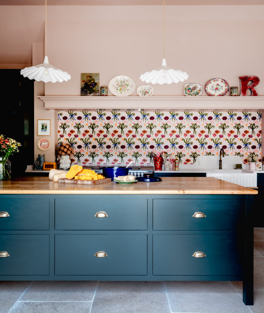
Guild Anderson’s Kitchen Colour Guide
Natural colours have long been used in interiors. Understated, sophisticated and classic, natural colours are extremely versatile, creating harmony in any home. Stone, linen, wicker, coir, wood, hessian
White is powerful, and a symbol of purity. Cool and calm, white will emphasise natural light. With so many subtle differences, selecting the right one can be overwhelming. Chalk, off-white, clotted cream, ice, snowdrop, lily
Grey is cool and understated with a balanced, neutral feel. Darker shades can be used to add strength and structure to a scheme; while lighter shades add softness. Graphite, anthracite, silver, steel, lead, elephant, mouse
Blue is an expansive colour, calm and airy just like the sky itself. Deep Blue has had a huge revival in interiors, it is refined and easy to live with. Baby blue, powder blue, Lapis, Wedgwood blue, sky blue, azure, aqua
Green will bring the outdoors in, creating a calm atmosphere in any room. Fresh and invigorating shades offer a modern twist, and is said to inspire creativity. Pea, leaf, fern, avocado, bottle
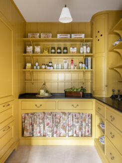
Yellow is uplifting, warming, like an embrace from the sun itself! Mood-boosting power of sunflowers, citrus accents of lemon. Lemon, sunflower, gravel, banana, mustard, buttercup
Red is associated with danger, fire and bright poisonous berries. Thought to provoke conversation, it works well in family areas, and dining rooms. Brick, Post Office, lipstick, strawberry, cherry
Pink is one of the most timeless colours in interiors. Warm and inviting throughout the day, while in the evening will create a cosy atmosphere. Rose, plaster, candy, bubblegum, magenta, raspberry, fuchsia


