Journal

A perfectly symmetrical room can make designing easy, but it doesn’t offer any challenges, and many designers will tell you that often it’s the most challenging of spaces that test them, and ultimately result in the most interesting design.
Awkward spaces require creative design solutions, they are not symmetrical and require a considered approach to conquer these tricky areas.
In one such space Guild Anderson were commissioned to create a family sized kitchen, befitting the graded listing of the manor house, but creating a contemporary room for modern family life.

The Challenges of an Awkward Shaped Room
The previous hand made kitchen was functional, it worked but the room was disjointed, and the first thing on entering the room was an awkward sink at an angle, with a cupboard above, and a large American style fridge freezer that dominated the space.
Nick approached the space as he does with every design; by considering if there are any alterations to the room itself that would enhance the function of the space. This goes above and beyond what is expected of a routine kitchen design.

Enhancing The Functionality of a Kitchen
When the skin of the room is peeled back one can sometimes see that stud walls or partitions have been previously added, often in ways that now inhibit the efficient working of the space, and that these can now be adjusted or indeed removed.
In this instance a section of the partition wall in question had been built to house the fridge freezer and so could now be taken back by about a metre, up to the overhead joist. Therefore no planning regulations had to be considered as nothing structural was being altered.
With this section of wall now removed, a large traditional dresser style cabinet creates a strong focus in the space. A defining statement at the far end of the room. Nick then introduced a number of other key features in the new design that open up the room and create a more functional and efficient kitchen with designated zones for washing up, cooking and preparing food.
"The cabinets that were previously used were standard off the shelf sizes and no consideration had been made to the flow or design of the space itself."
Nick Anderson

Natural Wood Contrasts With Hand Painted Cabinetry
The sink was moved from its awkward angle, to sit centrally below the Georgian sash window that overlooks the front on the house. Either side of the sink are a bin cabinet, a dishwasher, plate drying rack and shelving.
Everything needed is at hand in this washing area with these cabinets made using Scottish Elm, a stunning contrast to the rest of the hand painted cabinetry. The addition of natural wood to this area adds texture and interest, and really sets it apart from the rest of the kitchen, but as the style of the cabinetry is identical the kitchen design comes together as an aesthetic whole.

Glazed Cabinets Help To Lighten The Overall Scheme
Now, when you enter the room, you are immediately greeted by a painted glazed cabinet that houses glassware and crockery. The glazed cabinet is lighter with less weight at eye level and is a welcoming sight. It is shallower in depth than a standard off the shelf cupboard, designed this way to allow the sink area next to it to sit centrally beneath the window. This attention to detail in the design process allows the room to not only function more successfully but aligns the zones perfectly.
Abutting this is a run of cabinetry that houses a pull-out larder, integrated Fisher & Paykel fridge freezer and larder cabinet. By integrating the fridge freezer the cabinets feel like pieces of furniture. The slim pull out larder makes use of a pocket sized space, sitting neatly behind the shallow glazed cabinet, and is hidden behind a full size door to allow the run of cabinetry to look balanced, so that function does not compromise the aesthetics.
“If you have plenty of space, you can afford to lose some. Not every single centimetre needs to be filled. The wall cabinets in this kitchen design are elegant and purposefully do not match the width of the base units.”
Nick Anderson


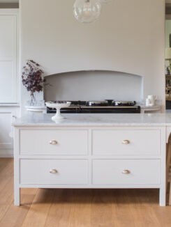
A Large Kitchen Island Creates a Central Focus
The AGA is flanked by two drawer cabinets, and above these are individual wall cabinets, not standard width, but narrow and more subtle in their form. They do not fill the wall, instead they allow for space around them, making this area feel lighter and more airy.
A kitchen such as this would not be complete without a stunning central island, and it is really important that the space around it be designed with functionality in mind. The client initially asked for the new kitchen design to incorporate the family kitchen table, however in order to give them the kitchen they truly wanted this was not possible.
To establish some form of symmetry out of the awkward shaped room and to allow for a better flow a new floor was laid from the kitchen in to the dining room next door. A room they now use more than ever before. Where once the kitchen table sat, this large island is the focal point of the room. Housing cupboards, a cooker, as well as a seating area with bar stools.

Careful Planning Ensures The Kitchen Functions Efficiently
The difference with a Guild Anderson designed kitchen is that there is an enormous amount of time given to the subtleties of function and making the space work with seamless efficiency.
This goes beyond designing the kitchen itself. It is the difference between simply designing the cabinetry and designing the actual room, the space and the way that it will be used. If that means removing walls, then we advise that sometimes by simply adjusting the footprint of the room, often in a very minor way, it can have an enormous impact on the final design of the space.
These fundamental details that Guild Anderson have used to adapt an awkward space allow the cabinetry to have a degree of authenticity. It allows them to feel as if they, and the room, have always been one.