Journal
In the second part of our series – The Best Colours for Country House Kitchens; we continue to look at the way that nature has shaped our decisions when it comes to choosing the best paint colours for country house kitchens.
It is no wonder that our clients are inspired by the colours and shades found in the natural habitat that surround their country home. In rural Wiltshire our streets are devoid of any harsh bright lighting; our towns and villages are sleepy in the winter months compared to the dazzlingly lit streets of a big city, and so our home’s colour pallet tends to be a little more refined and understated; more in keeping with its surroundings.
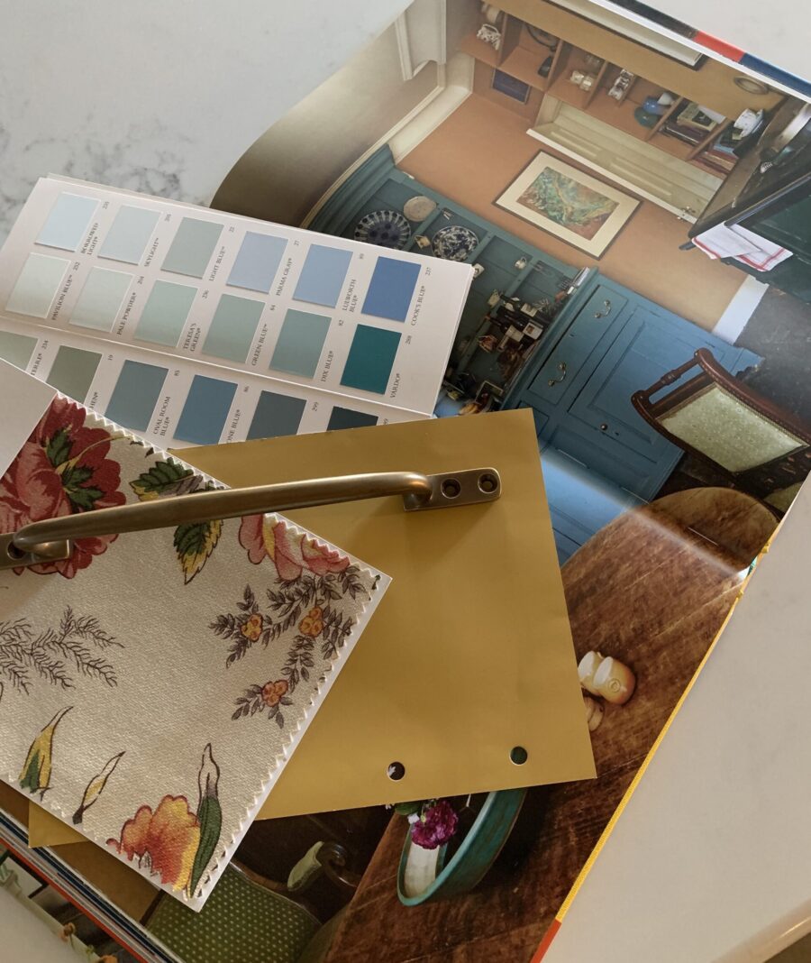
Fields of Gold
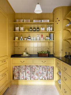
Buttermilk, egg yolk, sunshine, buttercup, lemon or primrose; each shade of yellow is inspired by nature itself. During the Victorian era, yellow was believed to be the colour most similar to light, and with an uplifting energy it can create instant warmth and drama to an otherwise dark space.
How brave are you? Creating a bold kitchen using yellow may take some nerve, but you will be rewarded with a kitchen that stands out from the crowd.
Yellow paints that Hannah Anderson would recommend are Paint and Paper Library – Pollen II, a shade that they describe as a rich deep traditional yellow that has gravitas and beauty; while Farrow & Ball India Yellow is a deep mustard yellow that is famously named after the pigment collected from the urine of cows fed on a special diet of mango leaves!
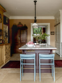
Working well with neutrals as well as blue, yellow is quite literally a colour that symbolises joy and happiness. Using yellow as a wall colour allows you to play with another contrasting bold shade for the cabinetry.
A beautiful freestanding piece of furniture such as a vividly painted dresser or freestanding cabinet can be so uplifting, and if you are a little more wary of using bright or stronger colours, painting the interior of the cupboard can still command attention without being so bold.
A dresser painted in a striking contrasting blue such as Farrow & Ball Oval Room Blue will enliven and inspire, or and alternative colour to consider is Farrow & Ball Stone Blue.
For those wishing to make their range cooker a statement piece, look no further than the range of colours at La Cornue. Your choice of finishes, combinations of materials, and colour options are almost unlimited.
Blue and yellow colours directly oppose each other on the colour wheel, creating complementary colour harmony
Warmer Tones
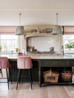
For a touch of vintage charm, consider pastel shades. Soft pink, an almost peachy, putty-like shade is a playful colour that stands for vitality and energy; working well with creams and equally well partnered with blue and green. Rich or chalky shades of pink can be a sophisticated choice and offer warmth to a kitchen.
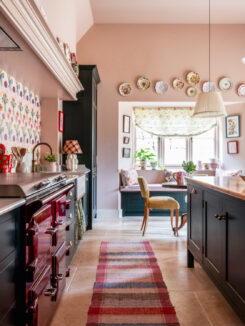
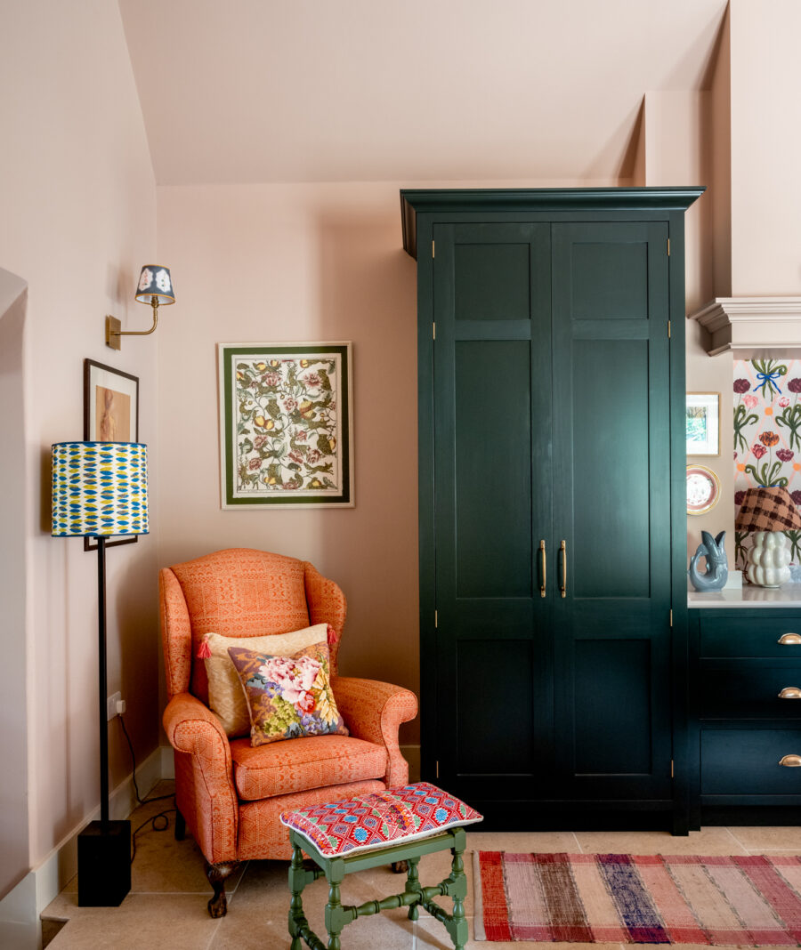
While you may not wish to paint the cabinetry in this warmer colour, you could consider painting the walls as seen here.
Mylands Hoxton Grey is a warm neutral developed for a contemporary interior near Shoreditch. With deep, warm umber and brown undertones, this pale neutral grey paint has a warming and calming aura, with a lot of depth and hints of violet.
In this cottage kitchen maximum impact has been created with the clever use of layers of colours, textures and pattern. Pink walls are painted Paint and Paper Library Desert Rose, such a soft pink with grey undertones; this colour works beautifully with deep fir green cabinetry in Farrow & Ball Studio Green
Paired with vibrant floral wallpaper from Polly Fern and a colourful bold Burgundy Everhot range cooker ensures this kitchen project is pretty with a contemporary twist.
To simplify this colour scheme it has been partnered with pale worktops and Marlborough tiles make a lovely antique white tile that has a slightly soft edge to it.
The sweetness of pink can be toned down when pared with contrasting tones of navy blue or dark teal; creating a much more atmospheric room
We offer a kitchen colour consultancy service when designing your bespoke kitchen.


